Untitled Document
Website Services

Mobile-Responsive Web Design for Los Angeles & Beyond

Most visitors never touch a desktop
Mobile-responsive design that works as well on a phone as a monitor

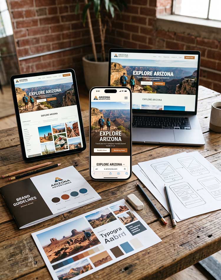
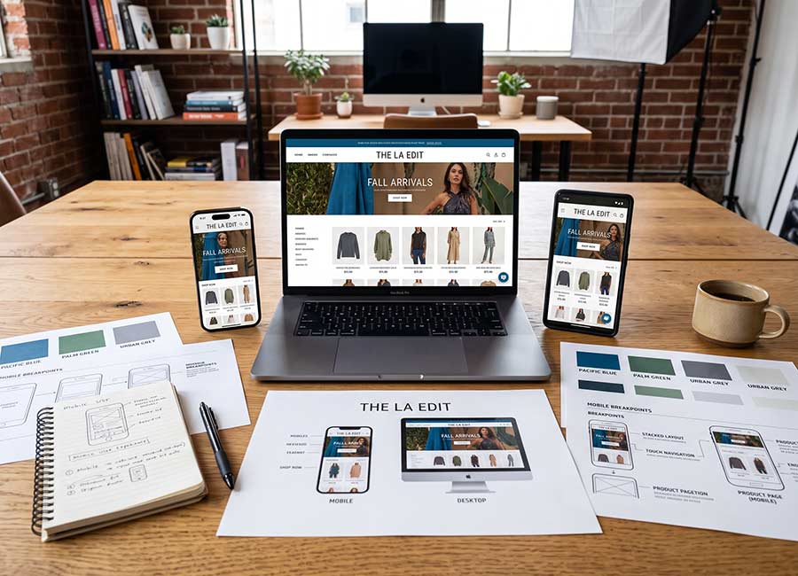
The Design Equation designs mobile-responsive websites for businesses in Los Angeles and across the country whose visitors are checking their site from a phone more often than not. Every layout is planned across screen sizes from the start, not adjusted after the fact, so the mobile experience never feels like an afterthought.
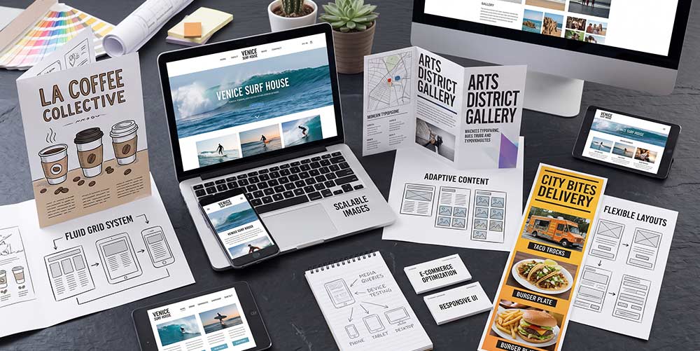
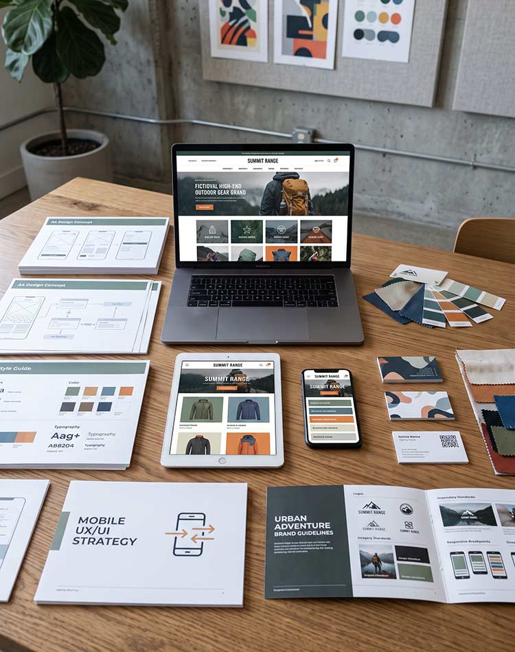
Mobile-responsive web design work by The Design Equation in Los Angeles
What mobile-responsive design looks like at The Design Equation
Every screen size planned for, not just tolerated
Mobile-First Layout Planning

Designs that start on the smallest screen and scale up, so nothing important gets lost.

Breakpoint Design

Layouts tailored to specific screen widths, not just stretched and squeezed to fit.

Touch-Friendly Interaction Design

Buttons, menus, and forms sized and spaced for fingers, not just cursor clicks.

Mobile Performance Optimization

Fast load times on mobile connections, where speed matters even more than on desktop.

Cross-Device Testing

Real testing across phones, tablets, and browsers, not just a resized browser window.

Responsive Design Built in Los Angeles. Tested on Every Screen.
Why businesses trust us with responsive design
Design that never treats mobile as an afterthought
Mobile-first design approach from The Design Equation
We believe in mobile-first thinking

Designing for the smallest screen first forces clarity that benefits every other screen too.

Real device testing from The Design Equation
We believe in real device testing

A resized browser window doesn't catch everything a real phone or tablet will.

High-end mobile-responsive design craft from The Design Equation
We believe in high-end craft

Every breakpoint and interaction considered carefully. Nothing goes live half-finished.

01

Planned Across Every Screen Deliberate

Every breakpoint designed intentionally, not left to a framework's default behavior.

02

A Boutique, High-End Approach Selective

We take on a limited number of website projects at a time so each one gets full attention.

03

Rooted in Los Angeles, CA Local Insight

Based in Los Angeles, we understand how mobile-heavy traffic really is for businesses in this market.

04

Working With Clients Nationwide National Reach

Our responsive design work extends well beyond Los Angeles, supporting businesses across the United States.

The Design Equation designing a mobile-responsive site in Los Angeles
Based in Los Angeles. Working with businesses everywhere.
If your site frustrates someone on their phone, it doesn't matter how good it looks on a laptop.

We design mobile-responsive websites for businesses in Los Angeles and across the country whose visitors are just as likely to arrive from a phone as a desktop. Every layout, button, and interaction is planned for how people actually use their devices, so the experience holds up no matter what screen it's viewed on.

Start a Conversation
Website Design

The full visual design your responsive layout is planned around.

Website Development

The build that turns responsive designs into a working, tested site.

Website Maintenance

Ongoing checks to make sure your site stays responsive as it grows.